Preview image. Unlock full-res
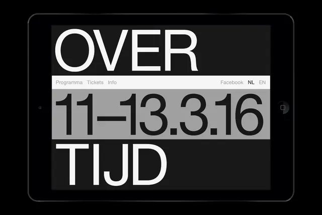
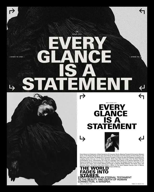
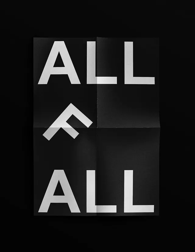
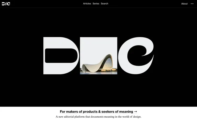
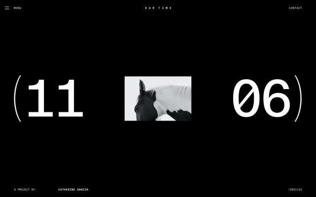
A minimalist, high-contrast black and white UI screen featuring large numerical typography and a central photographic element.
Summary
A minimalist, high-contrast black and white UI screen featuring large numerical typography and a central photographic element.
Visual description
The layout features large, white numbers '(11' and '06)' flanking a central black and white photograph of a horse. The background is solid black, with small, thin white text for 'MENU', 'OUR TIME', and 'CONTACT' at the top, and project details at the bottom.
Key takeaway
Use oversized, high-contrast typography paired with a central photographic focal point to create a dramatic, editorial-style digital interface.
Reuse notes
Apply this layout for high-end fashion portfolios or luxury brand landing pages where visual impact and minimalism are paramount.