Preview image. Unlock full-res
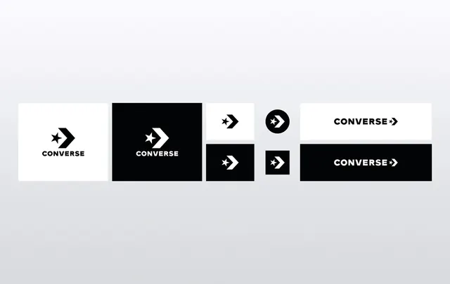
A collection of different logo treatments for the Converse brand, showcasing various layouts, colors, and orientations.
Summary
A collection of different logo treatments for the Converse brand, showcasing various layouts, colors, and orientations.
Visual description
A grid of six Converse logo variations including horizontal and stacked layouts, solid black and white blocks, and different icon placements. The designs explore the relationship between the star chevron symbol and the brand name.
Key takeaway
The brand maintains a strong identity through consistent iconography while experimenting with layout and high-contrast color blocks.
Reuse notes
These variations can be used to demonstrate brand flexibility across different media sizes and backgrounds.
More like this





Keep what you find
A free account saves references to boards and can send you a weekly email of picks based on what you save.
To see every result, go Pro.