Preview image. Unlock full-res
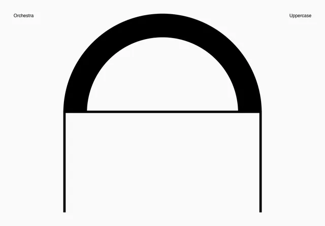
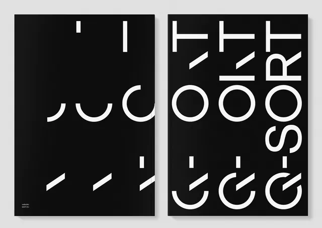
A minimalist, geometric logo featuring a thick arch shape over a horizontal line, flanked by the words 'Orchestra' and 'Uppercase'.
Summary
A minimalist, geometric logo featuring a thick arch shape over a horizontal line, flanked by the words 'Orchestra' and 'Uppercase'.
Visual description
The design features a large, bold black arch centered on a light gray background. Two thin vertical lines extend downwards from the base of the arch, and the words 'Orchestra' and 'Uppercase' are placed in small, clean sans-serif type at the top corners.
Key takeaway
The design conveys a sense of balance and architectural stability through its heavy geometric forms and ample white space.
Reuse notes
The arch and line elements can be adapted into a modular brand identity system for stationery and digital interfaces.
More like this

Keep what you find
A free account saves references to boards and can send you a weekly email of picks based on what you save.
To see every result, go Pro.