Preview image. Unlock full-res
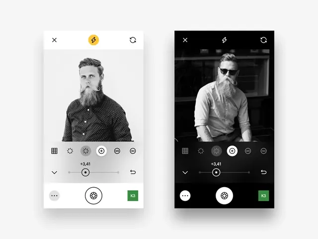
A side-by-side comparison of two distinct UI layouts featuring portrait photography, minimalist iconography, and a clean, structured grid system.
Summary
A side-by-side comparison of two distinct UI layouts featuring portrait photography, minimalist iconography, and a clean, structured grid system.
Visual description
The image shows two vertical mobile-style layouts. The left side features a man with a beard in a light-mode interface with green accents, while the right side features a man in glasses in a dark-mode interface with white accents.
Key takeaway
The design demonstrates how consistent UI elements like icons and buttons can be adapted across different color modes while maintaining a cohesive brand identity.
Reuse notes
The layout structure and icon placement can be reused for portfolio websites or professional profile apps.
More like this

Keep what you find
A free account saves references to boards and can send you a weekly email of picks based on what you save.
To see every result, go Pro.