Preview image. Unlock full-res
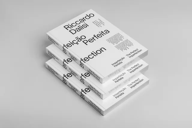
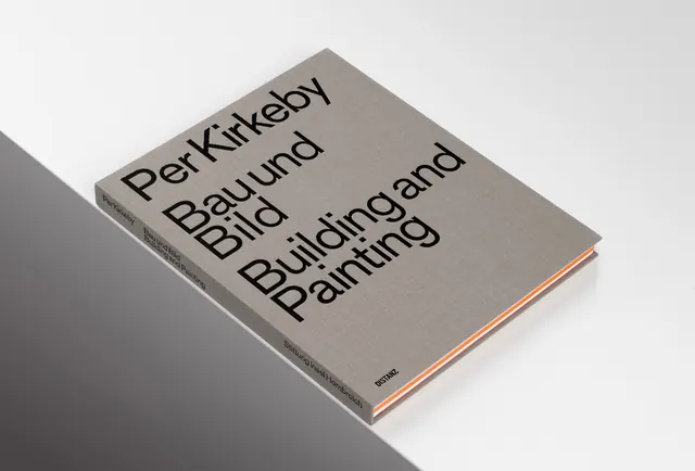
A book mockup featuring a grey textured cover with large, bold black typography in both German and English.
Summary
A book mockup featuring a grey textured cover with large, bold black typography in both German and English.
Visual description
The book features a grey textured cover with oversized sans-serif text reading 'Per Kirkeby', 'Bau und Bild', and 'Building and Painting' arranged in a dynamic, overlapping grid. The typography is black and varies in scale, creating a strong visual hierarchy. The book is shown at an angle against a neutral white background with a thin orange edge visible.
Key takeaway
Use oversized, overlapping typography in different languages to create a dynamic, grid-based layout that feels architectural.
Reuse notes
Use this approach for art monographs, architectural portfolios, or high-end editorial publications.