Preview image. Unlock full-res
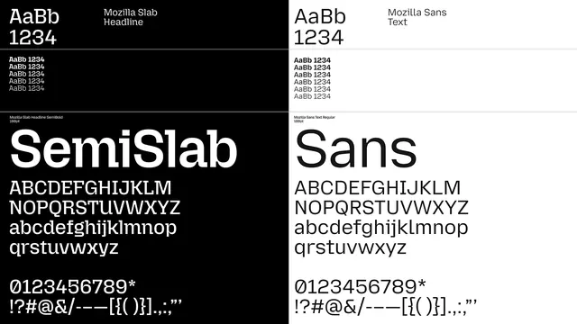
A side-by-side typographic comparison showcasing 'Mozilla Slab Headline' in a dark mode layout and 'Mozilla Sans Text' in a light mode layout.
Summary
A side-by-side typographic comparison showcasing 'Mozilla Slab Headline' in a dark mode layout and 'Mozilla Sans Text' in a light mode layout.
Visual description
The image is split vertically into a black left half and a white right half. The left side features white text including 'AaBb 1234', 'Mozilla Slab Headline', and 'SemiSlab' with various character sets. The right side features black text including 'AaBb 1234', 'Mozilla Sans Text', and 'Sans' with corresponding character sets.
Key takeaway
Use high-contrast, split-screen layouts to demonstrate the functional differences between slab-serif and sans-serif typefaces in dark and light modes.
Reuse notes
Use this layout when presenting font families or brand identity systems to show versatility across different UI themes.
More like this

Keep what you find
A free account saves references to boards and can send you a weekly email of picks based on what you save.
To see every result, go Pro.