Preview image. Unlock full-res
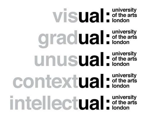
A typographic exploration of the University of the Arts London identity, showcasing different prefixes combined with a consistent 'ual' suffix and a vertical block element.
Summary
A typographic exploration of the University of the Arts London identity, showcasing different prefixes combined with a consistent 'ual' suffix and a vertical block element.
Visual description
The image displays five horizontal rows of text where different words (visual, gradual, unusual, contextual, intellectual) share a common 'ual' ending. Each row features a bold black vertical bar separating the main word from the 'university of the arts london' logo in a smaller, stacked format.
Key takeaway
The design demonstrates how a modular typographic system can create visual harmony while allowing for diverse linguistic variations.
Reuse notes
This layout can be used as a template for creating a series of related brand sub-categories or educational modules.
More like this

Keep what you find
A free account saves references to boards and can send you a weekly email of picks based on what you save.
To see every result, go Pro.