Preview image. Unlock full-res
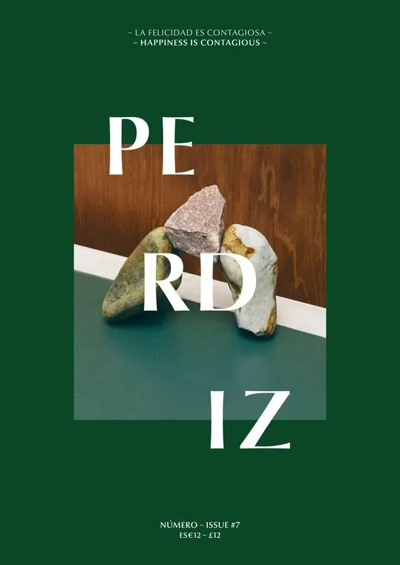
A minimalist magazine cover featuring a central photograph of stacked stones overlaid with large, white serif typography.
Summary
A minimalist magazine cover featuring a central photograph of stacked stones overlaid with large, white serif typography.
Visual description
A central rectangular photograph shows three natural stones stacked on a two-tone surface of wood and teal. Large, white serif letters spelling 'PERDIZ' are layered over the image, breaking the frame of the photograph. The background is a solid dark forest green.
Key takeaway
Use oversized, high-contrast serif typography layered over a central photographic element to create depth and a high-end editorial feel.
Reuse notes
Ideal for boutique magazine covers, luxury brand lookbooks, or artistic event posters.
More like this



Keep what you find
A free account saves references to boards and can send you a weekly email of picks based on what you save.
To see every result, go Pro.