Preview image. Unlock full-res
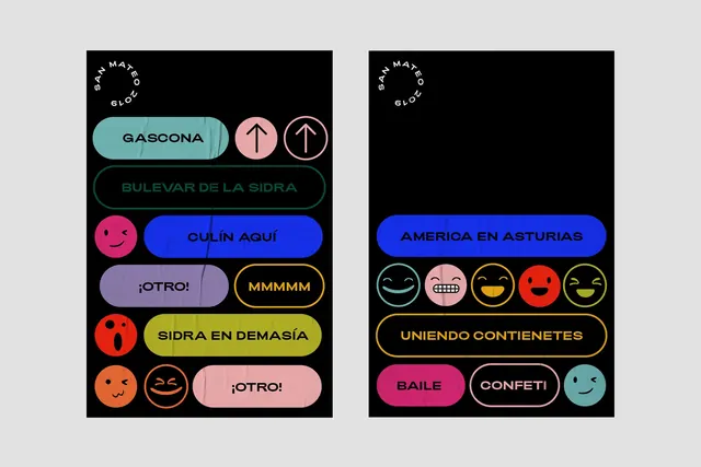
A side-by-side comparison of two UI layouts featuring rounded rectangular buttons with high-contrast colors and white typography.
Summary
A side-by-side comparison of two UI layouts featuring rounded rectangular buttons with high-contrast colors and white typography.
Visual description
The image shows two vertical panels with black backgrounds. Each panel contains several rounded buttons in colors like teal, pink, orange, and blue, featuring white text and simple icons.
Key takeaway
The design uses high-contrast color blocking and rounded shapes to create a clear, navigable user interface.
Reuse notes
The button styles and color palette can be adapted for web navigation or mobile app menus.
More like this



Keep what you find
A free account saves references to boards and can send you a weekly email of picks based on what you save.
To see every result, go Pro.