Preview image. Unlock full-res
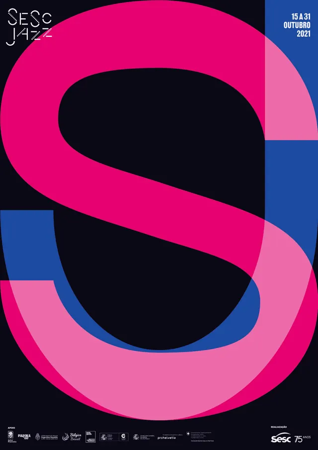
An event poster built from a giant overlapping letterform S in pink, blue, and black for a jazz festival.
Summary
A jazz festival poster dominated by one giant letter S, built from two overlapping color ribbons that split the page into distinct color zones.
Visual description
A near-square poster on black. A single oversized letter S fills almost the entire frame, drawn as two overlapping translucent ribbons: a magenta-pink ribbon and a lighter pink ribbon, crossing over a blue quadrant in the upper right. Where the shapes overlap they blend to a deeper tone. Small logotype "SESC JAZZ" sits top left in a thin geometric sans, and "15 A 31 OUTUBRO 2021" (dates) sit top right on the blue field in bold caps. A row of small sponsor and partner logos runs along the bottom edge, with the SESC 75th-anniversary mark at bottom right.
Key takeaway
A single oversized letterform, rendered as overlapping translucent shapes rather than a flat glyph, can carry an entire poster with almost no other imagery. The color-blend at the overlap adds depth without extra elements.
Reuse notes
Strong reference for event or festival branding where one initial or symbol needs to dominate a poster. The overlapping-ribbon technique works well when a design needs bold color contrast plus a sense of motion or layering, and pairs naturally with a small, restrained sponsor-logo strip at the foot of the page.