Preview image. Unlock full-res
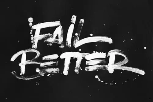
A high-contrast, expressive wordmark featuring the phrase 'Fail Better' in a distressed, painterly white font against a solid black background.
Summary
A high-contrast, expressive wordmark featuring the phrase 'Fail Better' in a distressed, painterly white font against a solid black background.
Visual description
The design features the words 'Fail' and 'Better' stacked vertically in a thick, textured white script that mimics paint strokes or chalk. Splatters and drips of white paint surround the lettering, creating a raw, DIY aesthetic.
Key takeaway
The design conveys a sense of raw creativity and resilience through its expressive, imperfect texture.
Reuse notes
This style can be adapted for streetwear branding, music posters, or edgy marketing campaigns.
More like this

Keep what you find
A free account saves references to boards and can send you a weekly email of picks based on what you save.
To see every result, go Pro.