Preview image. Unlock full-res
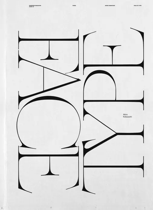
A black-and-white editorial poster where two huge serif words are rotated sideways and interlocked into a dense typographic block, credited to type designer Akira Kobayashi.
Summary
A magazine poster page that turns two words into a monumental typographic sculpture: enormous high-contrast serif capitals rotated 90 degrees and woven together so the letterforms overlap and interlock.
Visual description
On an off-white ground, the words are set in an ultra-high-contrast modern serif with hairline-thin serifs and heavy vertical strokes, rotated sideways so they read bottom-to-top in two interlaced columns that fill nearly the whole page. Letters from the two words slot between and overlap one another, forming a dense black-and-white lattice. A slim editorial header runs across the top in tiny sans-serif columns (magazine name, issue number, feature title), and a small credit "Akira Kobayashi" sits quietly in the right margin. No color, no imagery, only type.
Key takeaway
Rotating display type 90 degrees and interleaving two words converts a headline into a full-page graphic; the extreme thick-thin serif contrast supplies all the texture. Tiny functional labels at the edges keep the piece legible as an editorial page.
Reuse notes
Ideal reference for typography-led editorial openers, type-foundry promotion, or posters about type itself. Works only with a display face that survives extreme scale; legibility is deliberately sacrificed, so pair it with small clear metadata at the margins.
More like this


Keep what you find
A free account saves references to boards and can send you a weekly email of picks based on what you save.
To see every result, go Pro.