Preview image. Unlock full-res
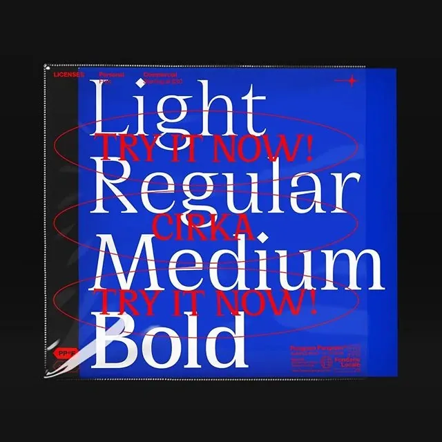
A typographic specimen showcasing different font weights on a blue background with red call-to-action text.

Summary
A typographic specimen showcasing different font weights on a blue background with red call-to-action text.
Visual description
Large white serif text displaying 'Light', 'Regular', 'Medium', and 'Bold' is stacked vertically on a vibrant blue background. Red all-caps text reading 'TRY IT NOW!' and 'CIRCA' is layered over the white type with red elliptical outlines. The composition uses high contrast and overlapping elements to create depth.
Key takeaway
Layering oversized serif typography with bright, contrasting call-to-action text creates a high-energy, experimental look.
Reuse notes
Use this style for bold promotional posters or social media graphics that need to grab immediate attention through typographic hierarchy.
More like this
Keep what you find
A free account saves references to boards and can send you a weekly email of picks based on what you save.
To see every result, go Pro.