Preview image. Unlock full-res
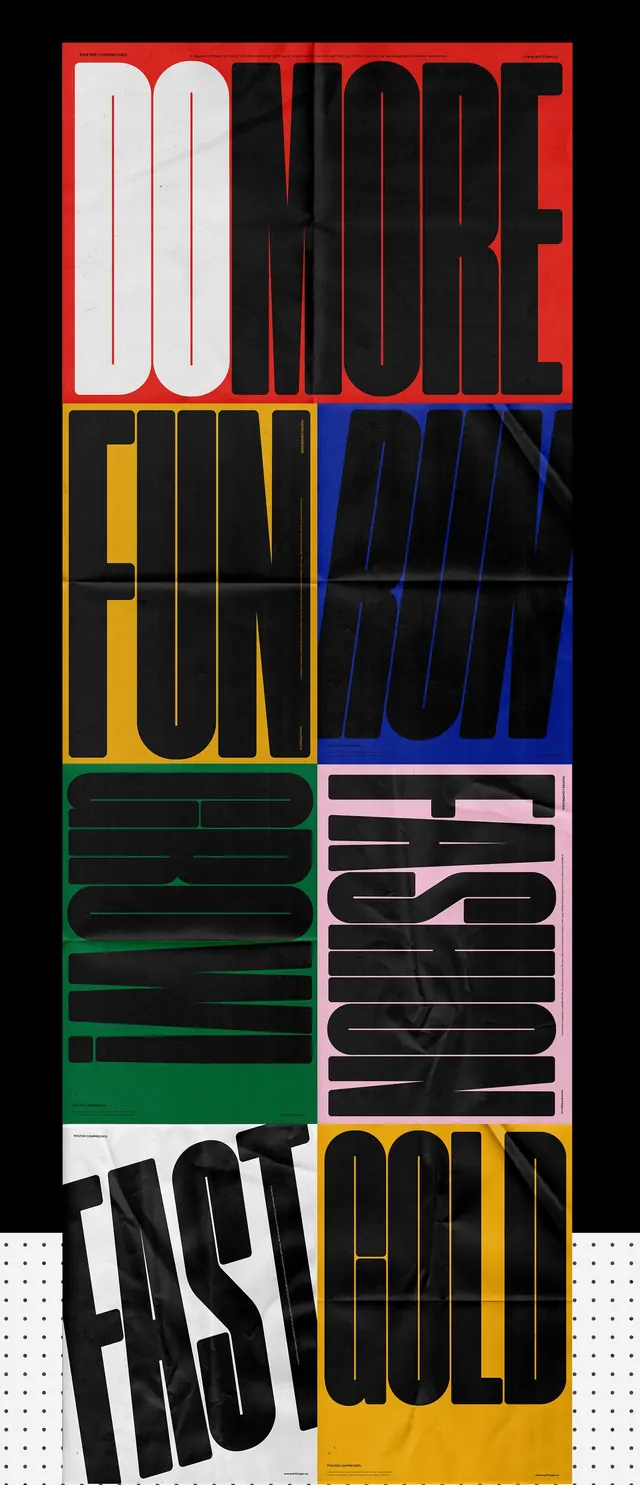
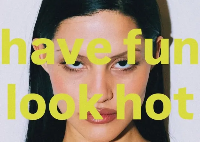
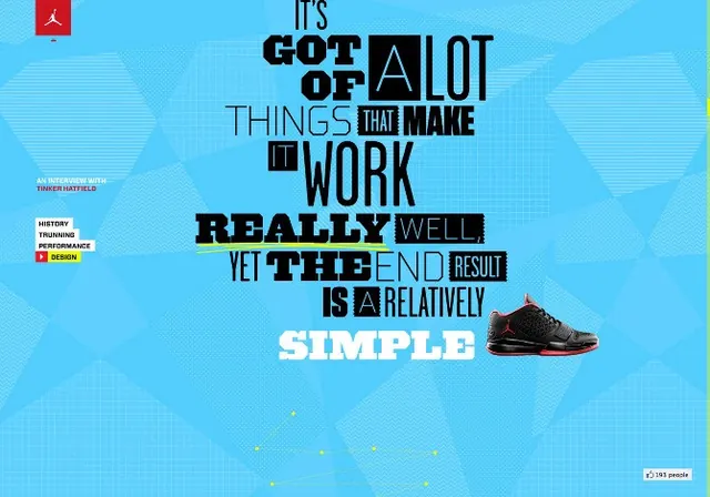
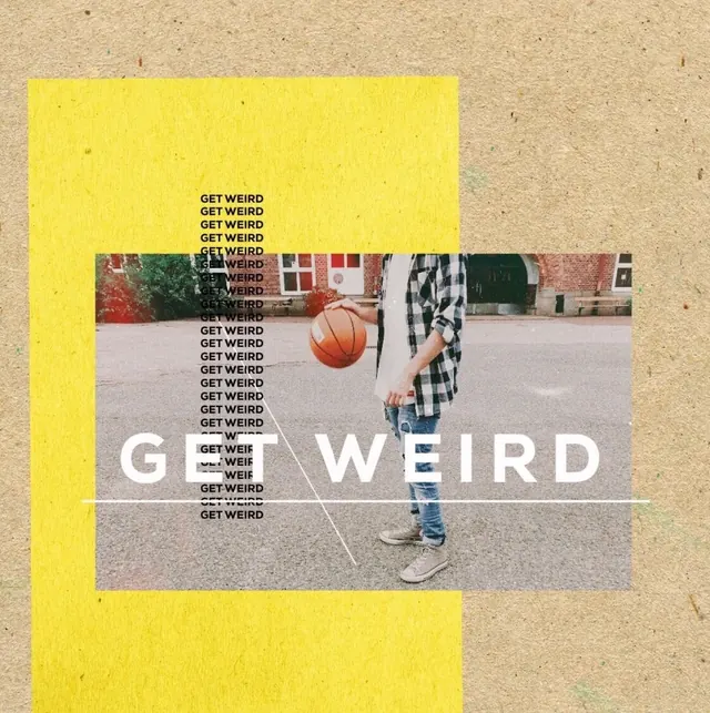
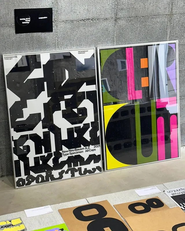
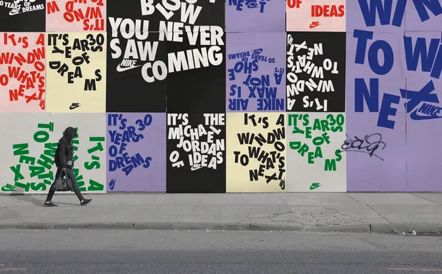
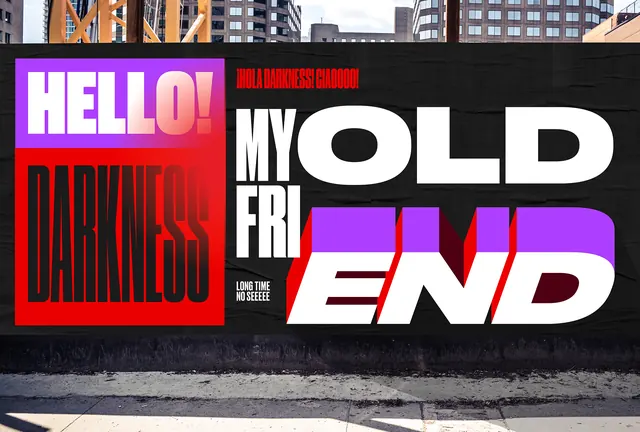
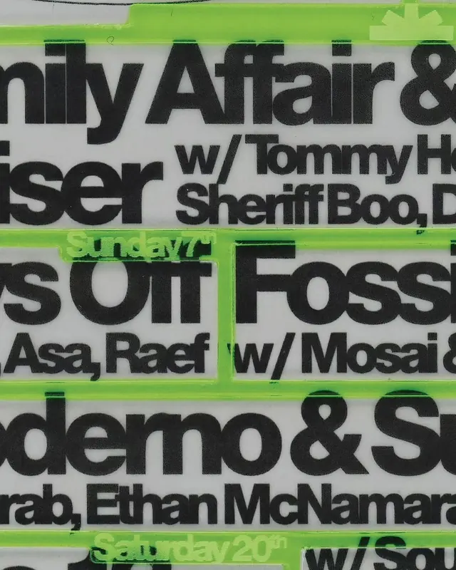
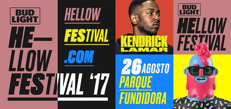
A multi-panel branding showcase for the 'Hello Festival' featuring bold typography, high-contrast color blocks, and promotional imagery.
Stylebrutalist, neo-brutalist, boxed, maximalist
Colorhigh-contrast, vibrant
Typesans-serif, oversized, all-caps, display
Palette
#1D2F42
#B57F81
#DBAC1F
#E1F0BD
#8A3441
Summary
A multi-panel branding showcase for the 'Hello Festival' featuring bold typography, high-contrast color blocks, and promotional imagery.
Visual description
The design uses a grid layout with high-contrast black, yellow, and red blocks. It features large, bold sans-serif typography, a portrait of a man, and a stylized illustration of a person in a red hat with sunglasses.
Key takeaway
The branding uses aggressive scale and high-contrast colors to create a high-energy, festival-ready visual identity.
Reuse notes
The bold typographic layout and high-contrast color blocking can be adapted for other event marketing materials.