Preview image. Unlock full-res
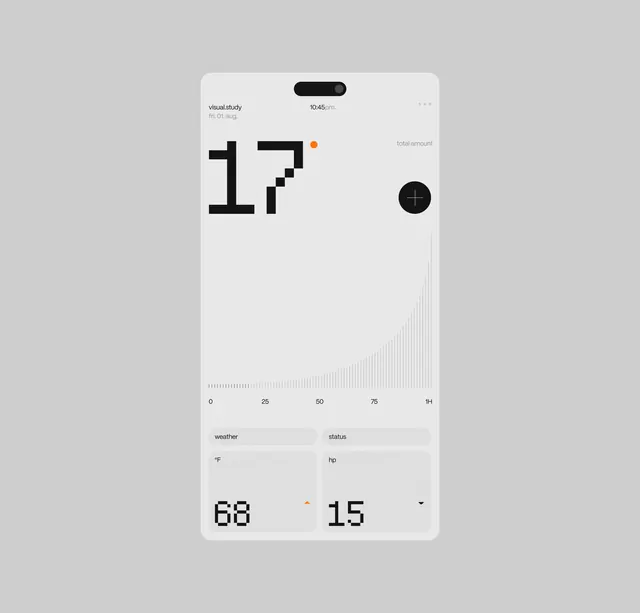
A high-fidelity mobile user interface design featuring large numeric displays, a subtle data visualization curve, and a clean, monochromatic layout.
Summary
A high-fidelity mobile user interface design featuring large numeric displays, a subtle data visualization curve, and a clean, monochromatic layout.
Visual description
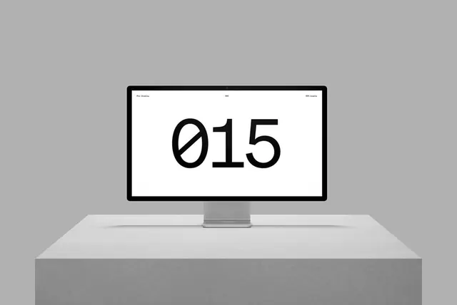
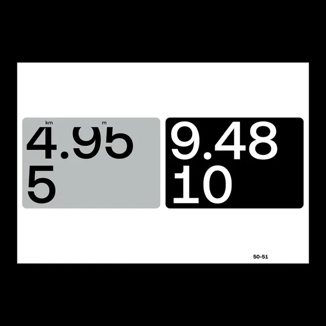
The layout uses a light grey background with high-contrast black oversized numbers for '17', '68', and '15'. A thin, light grey curved line graph spans the center, and small orange dots provide subtle accents. The interface is organized into distinct rectangular sections with thin borders.
Key takeaway
Use oversized, bold typography for primary data points to create immediate visual hierarchy within a minimalist layout.
Reuse notes
Apply this style when designing dashboard interfaces for fitness or financial apps where clarity and data readability are paramount.
More like this
Keep what you find
A free account saves references to boards and can send you a weekly email of picks based on what you save.
To see every result, go Pro.