Preview image. Unlock full-res
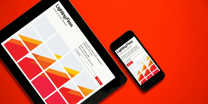
A responsive web design showcase featuring a tablet and a smartphone displaying the same website layout with geometric patterns and bold typography against a red background.
Summary
A responsive web design showcase featuring a tablet and a smartphone displaying the same website layout with geometric patterns and bold typography against a red background.
Visual description
The design features a grid of colorful geometric shapes in red, orange, and yellow on a white background. The text 'Lighting Fires' is displayed in a bold sans-serif font at the top. The devices are placed diagonally over a solid, vibrant red background.
Key takeaway
Use bold geometric color blocks to create visual interest and structure in a minimalist layout.
Reuse notes
Use this style for landing pages or digital portfolios that need a high-energy, modern aesthetic.
More like this



Keep what you find
A free account saves references to boards and can send you a weekly email of picks based on what you save.
To see every result, go Pro.