Preview image. Unlock full-res
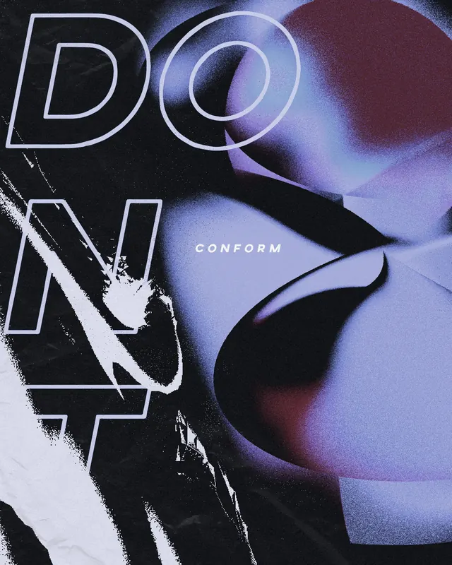
A high-contrast, experimental poster featuring large outlined typography layered over abstract 3D organic shapes.
Summary
A high-contrast, experimental poster featuring large outlined typography layered over abstract 3D organic shapes.
Visual description
Large, outlined sans-serif letters spelling 'DON'T' dominate the left side, partially obscured by a white brushstroke. The background consists of soft, gradient-heavy 3D organic forms in shades of purple, blue, and dark tones. The word 'CONFORM' is placed in a small, clean sans-serif font in the center.
Key takeaway
Layering oversized outlined typography with soft, grainy 3D gradients creates a sense of depth and tension.
Reuse notes
Use this style for edgy event posters, music album covers, or experimental brand campaigns.