Preview image. Unlock full-res
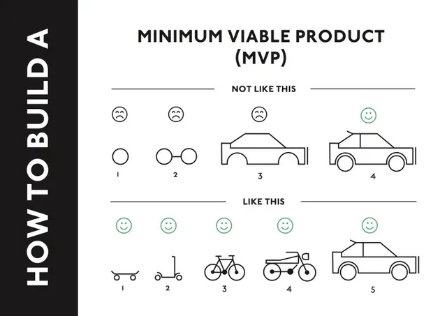
A black and white infographic illustrating the difference between a 'Not Like This' product (complex, over-engineered) and a 'Like This' product (simple, functional) to explain MVP concepts.
Summary
A black and white infographic illustrating the difference between a 'Not Like This' product (complex, over-engineered) and a 'Like This' product (simple, functional) to explain MVP concepts.
Visual description
The image features a vertical layout with a black sidebar on the left containing white text. The main area shows two rows of line-art icons comparing complex, multi-feature designs against simplified, core-functionality designs.
Key takeaway
Focus on building the core functionality of a product first rather than over-complicating it with unnecessary features.
Reuse notes
This layout can be reused to explain any 'less is more' concept or to contrast complex workflows with streamlined processes.
More like this



Keep what you find
A free account saves references to boards and can send you a weekly email of picks based on what you save.
To see every result, go Pro.