Preview image. Unlock full-res
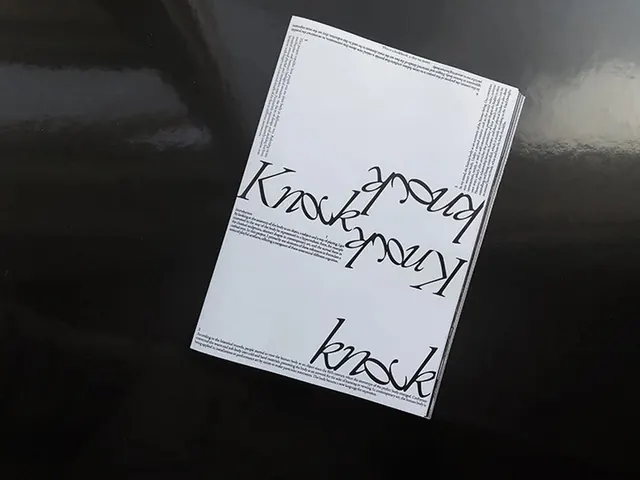
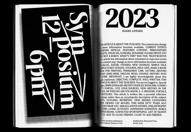
A high-contrast, monochrome editorial layout featuring the word 'Knock' repeated in various orientations and sizes.
Summary
A high-contrast, monochrome editorial layout featuring the word 'Knock' repeated in various orientations and sizes.
Visual description
The design features the word 'Knock' repeated across a white page in a large, black, stylized serif display font. The text is arranged in various orientations, including upside-down and diagonal, creating a rhythmic, layered effect against blocks of small body text.
Key takeaway
Use repetitive, oversized typography in varying orientations to create a strong visual rhythm and break traditional grid structures.
Reuse notes
Apply this approach when designing experimental magazine spreads or high-impact posters where type serves as the primary graphic element.
More like this
Keep what you find
A free account saves references to boards and can send you a weekly email of picks based on what you save.
To see every result, go Pro.