Preview image. Unlock full-res
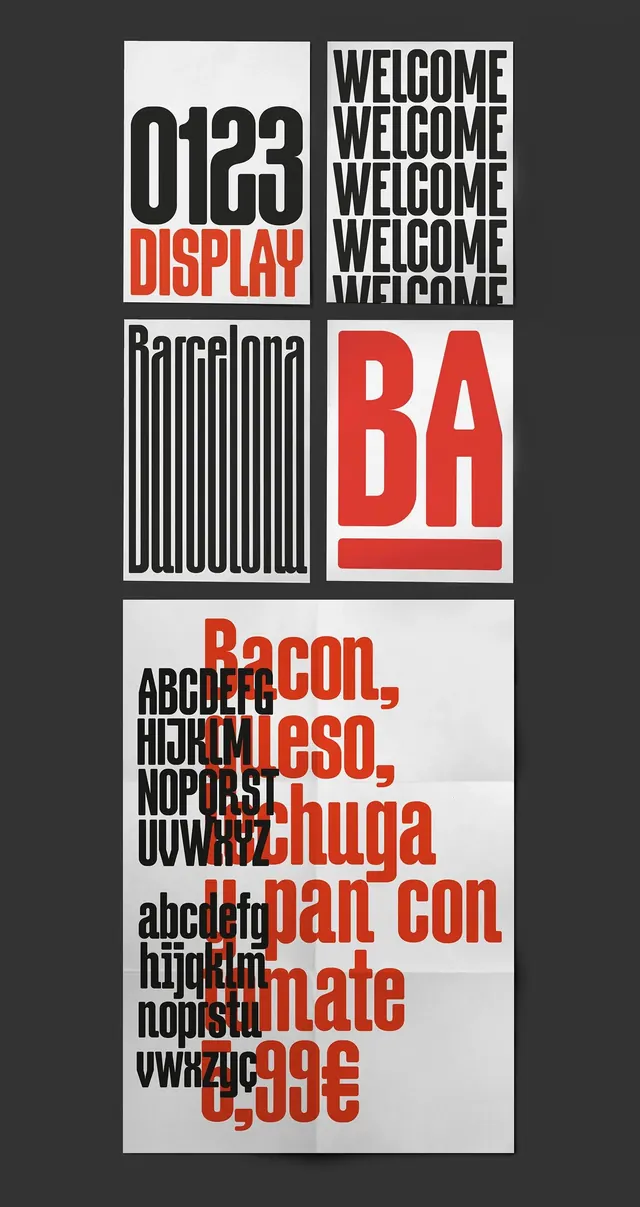
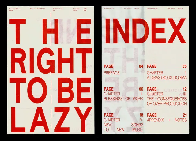
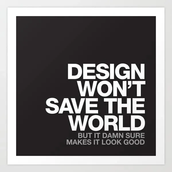
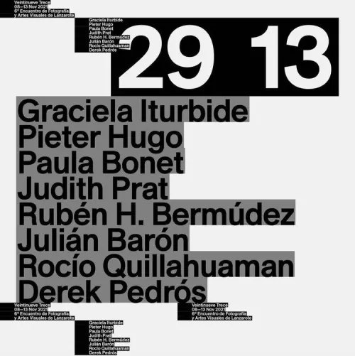
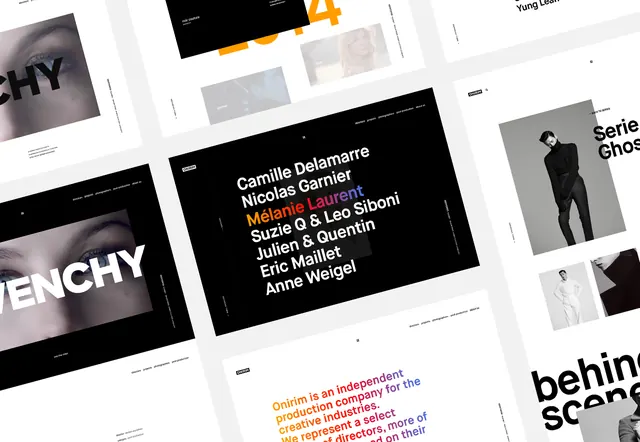
A collection of four graphic panels showcasing various typographic treatments, including oversized display type, repetitive text blocks, and a dense word cloud, all organized within a strict grid system.
Summary
A collection of four graphic panels showcasing various typographic treatments, including oversized display type, repetitive text blocks, and a dense word cloud, all organized within a strict grid system.
Visual description
The image features four distinct panels: one with '0123' display text, one with a repetitive 'WELCOME' block, one with a vertical 'BA' and 'Barcelona' layout, and a final dense word cloud of food items. Each panel utilizes a heavy black and white contrast with a focus on structural alignment.
Key takeaway
The design demonstrates how varying typographic weights and densities can create visual interest within a rigid, minimalist grid.
Reuse notes
Can be used as inspiration for editorial layouts, brand identity systems, or experimental poster designs.
More like this
Keep what you find
A free account saves references to boards and can send you a weekly email of picks based on what you save.
To see every result, go Pro.