Preview image. Unlock full-res
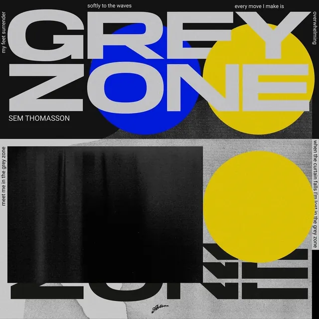
A square album cover for Sem Thomasson's 'Grey Zone', splitting bold condensed wordmark type with overlapping blue and yellow circles and a torn-paper photo insert.
Summary
A square music artwork for "Grey Zone" by Sem Thomasson, splitting the composition into a black upper half with oversized condensed type and a lighter lower half built from a torn, wave-textured photo insert.
Visual description
The top half is black, dominated by the words "GREY ZONE" in massive light-grey condensed sans-serif letters, partly overlapped by a solid blue circle and a solid yellow circle. Small lyric fragments run in thin type along the top edges and right margin. The artist name "SEM THOMASSON" sits in a plain sans-serif beneath the main wordmark. The bottom half shifts to a lighter grey, textured background with a black rectangular photo insert showing a rippled, wave-like surface, another yellow circle bleeding off the right edge, and the word "ZONE" repeated in outline type partly obscured behind the photo block.
Key takeaway
Repeating the same headline word across two visually distinct halves of a cover, once in solid type and once in outline behind a photo insert, creates a two-act composition within a single square canvas.
Reuse notes
A strong reference for music artwork, gig posters, or any brutalist type-driven design system that wants to combine grid-breaking scale with a restrained three-color palette. The overlapping circles read best against a near-black ground.