Preview image. Unlock full-res
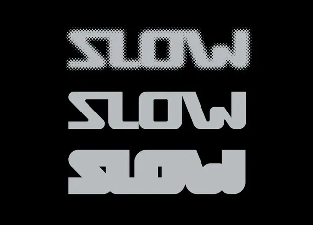
A vertical composition featuring three variations of the word 'SLOW' in a bold, stylized typeface.
Summary
A vertical composition featuring three variations of the word 'SLOW' in a bold, stylized typeface.
Visual description
The image displays three versions of the word 'SLOW' stacked vertically on a black background. The top version is composed of dots, the middle version is a solid bold block, and the bottom version features a distorted, liquid-like stretch.
Key takeaway
The design explores different textures and weights of the same word to convey different visual energies.
Reuse notes
Can be used as a study for kinetic typography or as a graphic element in a minimalist brand identity.
More like this
Keep what you find
A free account saves references to boards and can send you a weekly email of picks based on what you save.
To see every result, go Pro.