Preview image. Unlock full-res
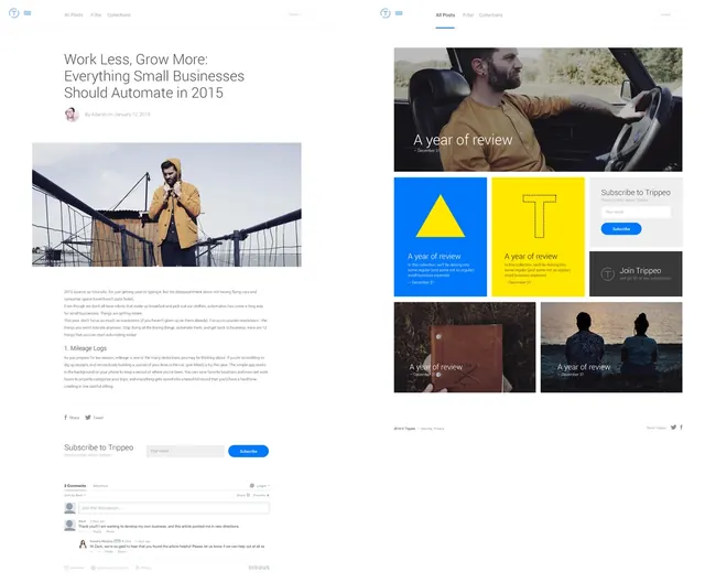
A side-by-side presentation of two different web design layouts: a long-form editorial blog post on the left and a grid-based portfolio or landing page on the right.
Summary
A side-by-side presentation of two different web design layouts: a long-form editorial blog post on the left and a grid-based portfolio or landing page on the right.
Visual description
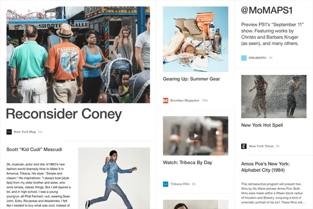
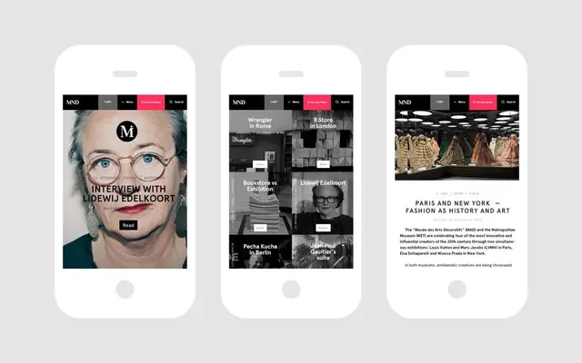
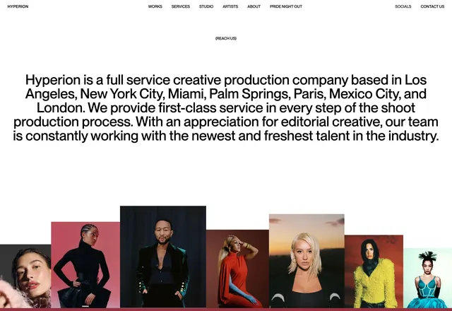
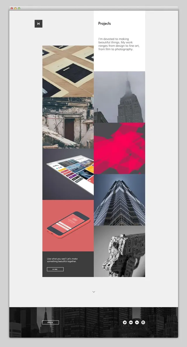
The left layout features a single-column editorial structure with a large hero photograph and centered text. The right layout utilizes a modular grid with varying block sizes, combining photography with solid color blocks and large typographic elements.
Key takeaway
Use a modular grid system to create visual hierarchy and variety when displaying diverse content types like images and text blocks.
Reuse notes
Reach for this when designing portfolio sites or content-heavy landing pages that need to balance imagery with readability.
More like this
Keep what you find
A free account saves references to boards and can send you a weekly email of picks based on what you save.
To see every result, go Pro.