Preview image. Unlock full-res
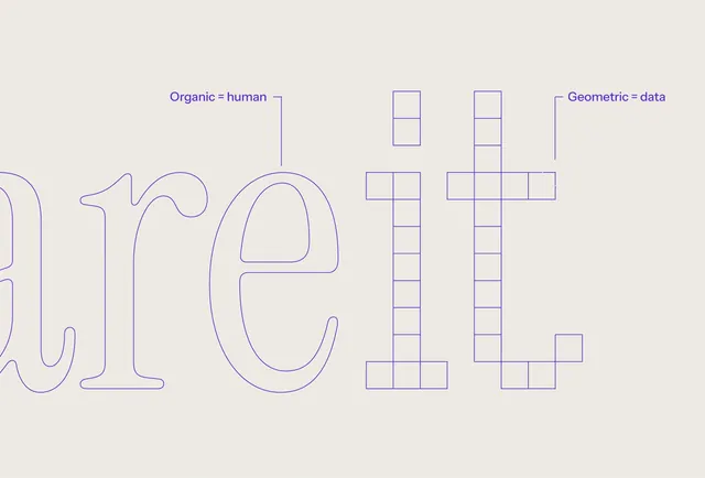
A typographic design featuring the word 'areit' in a light purple outline, contrasting organic and geometric letterforms.
Summary
A typographic design featuring the word 'areit' in a light purple outline, contrasting organic and geometric letterforms.
Visual description
The word 'areit' is rendered in a thin, light purple outline. The letters 'a', 'r', and 'e' feature rounded, organic shapes, while the 'i' and 't' are constructed with rigid, geometric lines and blocks.
Key takeaway
The design effectively balances soft, human-centric curves with structured, technical geometry.
Reuse notes
This style can be adapted for branding that requires a balance between approachable and precise aesthetics.
More like this

Keep what you find
A free account saves references to boards and can send you a weekly email of picks based on what you save.
To see every result, go Pro.