Preview image. Unlock full-res
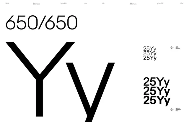
A minimalist typographic layout featuring large, stylized 'Y' characters and numerical text in a high-contrast black and white scheme.
Summary
A minimalist typographic layout featuring large, stylized 'Y' characters and numerical text in a high-contrast black and white scheme.
Visual description
The design features two large, overlapping 'Y' characters in the center, flanked by '650/650' at the top left and '25YY' repetitions on the right. The layout uses a clean, grid-like structure with significant white space.
Key takeaway
The design demonstrates how bold, oversized typography can create a strong visual identity through geometric balance and high contrast.
Reuse notes
This layout can be adapted for brand identity guidelines, editorial headers, or minimalist posters.
More like this


Keep what you find
A free account saves references to boards and can send you a weekly email of picks based on what you save.
To see every result, go Pro.