Preview image. Unlock full-res
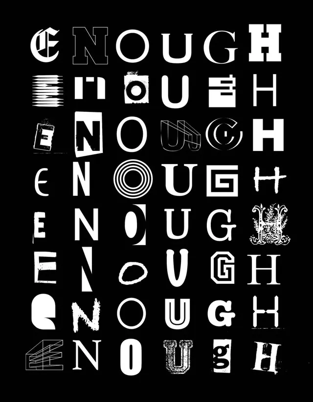
A grid of various typographic treatments for the word 'ENOUGH', exploring different weights, enclosures, and decorative elements.
Summary
A grid of various typographic treatments for the word 'ENOUGH', exploring different weights, enclosures, and decorative elements.
Visual description
A vertical grid of 15 different typographic iterations of the word 'ENOUGH'. The designs vary by using different font weights, outlines, solid blocks, and circular enclosures.
Key takeaway
The design demonstrates how a single word can be reimagined through diverse structural and stylistic typographic treatments.
Reuse notes
Can be used as a reference for logo exploration or as a decorative typographic pattern in editorial design.
More like this

Keep what you find
A free account saves references to boards and can send you a weekly email of picks based on what you save.
To see every result, go Pro.