Preview image. Unlock full-res
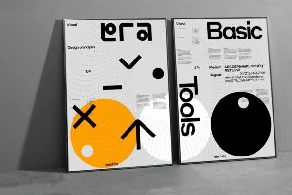
A side-by-side presentation of two distinct typography specimens, 'Era' and 'Basic', showcasing contrasting design aesthetics.
Summary
A side-by-side presentation of two distinct typography specimens, 'Era' and 'Basic', showcasing contrasting design aesthetics.
Visual description
Two vertical posters lean against a wall. The left poster features a bold orange circle and black geometric shapes with the word 'era'. The right poster features a large black circle and the word 'Basic' in a clean, sans-serif font.
Key takeaway
The design demonstrates how contrasting geometric shapes and heavy typography can create a cohesive visual identity.
Reuse notes
Use as a reference for high-contrast layout structures and bold typographic hierarchy.
More like this
Keep what you find
A free account saves references to boards and can send you a weekly email of picks based on what you save.
To see every result, go Pro.