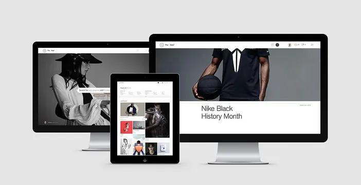
Preview image. Unlock full-res
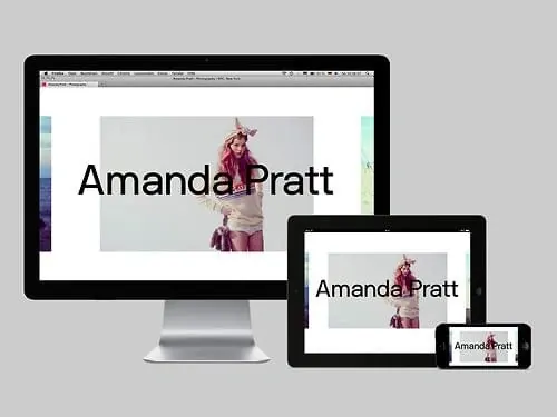
A multi-device mockup showcasing a website layout featuring a black and white photography theme.
Summary
A multi-device mockup showcasing a website layout featuring a black and white photography theme.
Visual description
Three screens (desktop, laptop, and mobile) display a website with a black and white aesthetic. The content features a large hero image of a person and a grid of smaller images.
Key takeaway
The design demonstrates a clean, responsive layout that maintains visual consistency across different screen sizes.
Reuse notes
Use as a reference for responsive web design layouts and high-contrast photography presentation.
More like this

Keep what you find
A free account saves references to boards and can send you a weekly email of picks based on what you save.
To see every result, go Pro.