Preview image. Unlock full-res
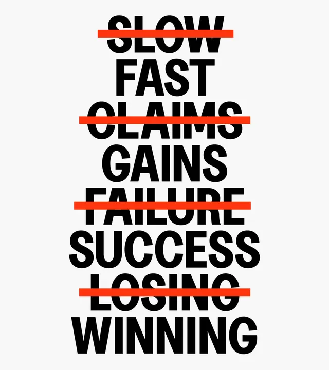
A vertical typographic composition featuring contrasting pairs of words separated by horizontal red lines.
Summary
A vertical typographic composition featuring contrasting pairs of words separated by horizontal red lines.
Visual description
Black bold sans-serif text is stacked vertically against a white background. Each pair of antonyms is bisected by a thick horizontal red line.
Key takeaway
Uses high-contrast typography and simple geometric lines to create a striking visual hierarchy of opposites.
Reuse notes
Can be used as a layout reference for posters or social media graphics highlighting dualities.
More like this
Keep what you find
A free account saves references to boards and can send you a weekly email of picks based on what you save.
To see every result, go Pro.