Preview image. Unlock full-res
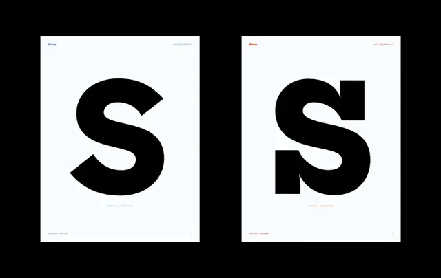
A side-by-side comparison of two different typographic treatments of the letter 'S'.
Summary
A side-by-side comparison of two different typographic treatments of the letter 'S'.
Visual description
Two black square frames containing a large, bold black letter 'S' on a white background. The left 'S' features rounded terminals and a thick stroke, while the right 'S' features sharp, blocky terminals and a more geometric construction.
Key takeaway
The design demonstrates how subtle changes in stroke terminals and curvature can drastically alter the personality of a single character.
Reuse notes
Use as a reference for exploring geometric letterform construction and weight balance.
More like this

Keep what you find
A free account saves references to boards and can send you a weekly email of picks based on what you save.
To see every result, go Pro.