Preview image. Unlock full-res
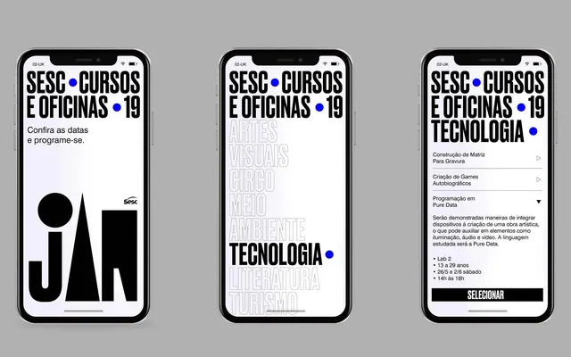
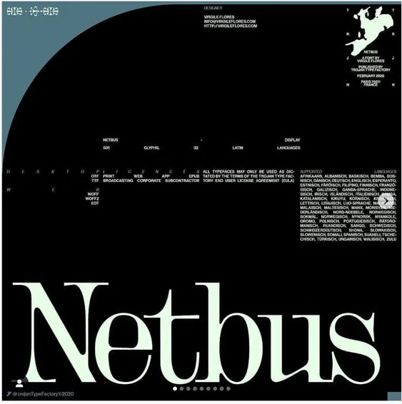
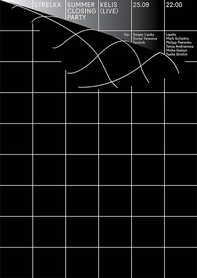
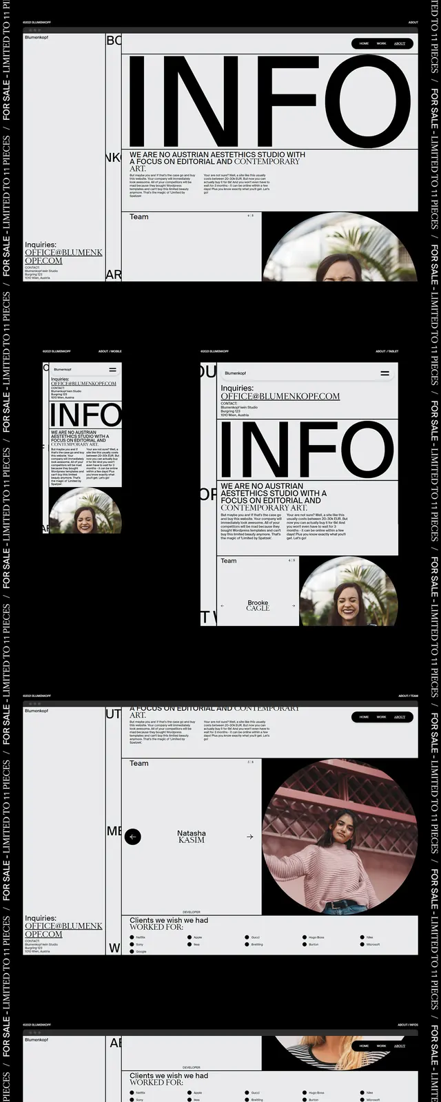
A cohesive visual identity for a technology training program featuring three distinct layout variations for mobile and print.
Summary
A cohesive visual identity for a technology training program featuring three distinct layout variations for mobile and print.
Visual description
Three vertical layouts featuring a bold black and white color scheme. The designs utilize heavy grid structures, oversized typography, and high-contrast blocks to display course information and branding.
Key takeaway
The design uses a rigorous Swiss-style grid to organize dense information into a clean, high-impact visual hierarchy.
Reuse notes
Apply the high-contrast grid system and oversized typography to educational materials or technical documentation.
More like this
Keep what you find
A free account saves references to boards and can send you a weekly email of picks based on what you save.
To see every result, go Pro.