Preview image. Unlock full-res
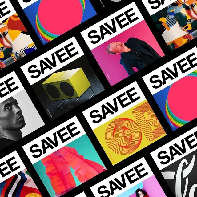
A diagonally tilted mosaic of square brand posters, each pairing a bold black sans-serif wordmark on a white band with a vivid image: portraits, 3D renders, and geometric graphics.

Summary
A brand-identity showcase built as a tilted checkerboard of square posters on black: every tile repeats the same heavy black all-caps wordmark on a white strip, while the image half changes wildly from tile to tile.
Visual description
The whole grid is rotated roughly 45 degrees with thick black gutters between tiles. Each poster splits into a white band carrying a chunky grotesque wordmark and an image panel: a rainbow-ringed pink circle on blue, a black-and-white athlete portrait, a suited man on magenta, a yellow speaker cube on dark grey, concentric orange ring-letters on yellow, crumpled coral fabric on teal, colorful toy-like 3D figures, and a script-lettering tile. Tiny vertical credit lines run along tile edges. The repetition of one logotype against constantly shifting art creates a drumbeat rhythm.
Key takeaway
A rigid lockup (same type, same white band) lets the imagery go anywhere without losing brand coherence; tilting the grid and adding fat black gutters turns a poster series into one energetic mosaic.
Reuse notes
Great model for brand-launch social carousels, identity case-study covers, or OOH poster families. Requires a genuinely flexible logotype and consistently art-directed imagery; keep the tilt for the group shot, not for individual posters.
More like this
Keep what you find
A free account saves references to boards and can send you a weekly email of picks based on what you save.
To see every result, go Pro.