Preview image. Unlock full-res
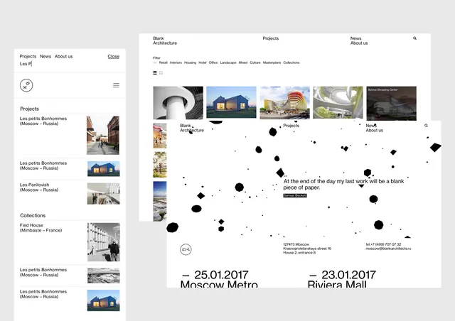
A pair of minimalist event posters featuring a grid-based layout with photography, typography, and abstract dot patterns.
Summary
A pair of minimalist event posters featuring a grid-based layout with photography, typography, and abstract dot patterns.
Visual description
The design uses a clean white background with a structured grid containing small rectangular photos and text blocks. A prominent dot pattern creates a visual connection between the two posters, while large dates and titles anchor the bottom.
Key takeaway
The layout demonstrates how to balance dense information with ample white space using a strict grid system.
Reuse notes
Apply the grid structure and dot-pattern motif to multi-page editorial layouts or series of event advertisements.
More like this




Keep what you find
A free account saves references to boards and can send you a weekly email of picks based on what you save.
To see every result, go Pro.