Preview image. Unlock full-res
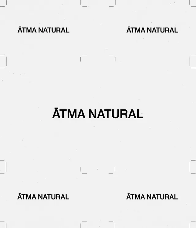
A minimalist typographic layout featuring a centered brand name surrounded by repeating instances of the same wordmark in a grid-like arrangement.
Summary
A minimalist typographic layout featuring a centered brand name surrounded by repeating instances of the same wordmark in a grid-like arrangement.
Visual description
The image shows the words 'ÄTMA NATURAL' in a clean, bold sans-serif font. The main wordmark is centered, while smaller versions are placed symmetrically in the corners and mid-sections of the frame.
Key takeaway
The design emphasizes balance and white space to create a sense of purity and focus.
Reuse notes
Use this layout style for brand identity guidelines or minimalist packaging concepts.
More like this
Keep what you find
A free account saves references to boards and can send you a weekly email of picks based on what you save.
To see every result, go Pro.