Preview image. Unlock full-res
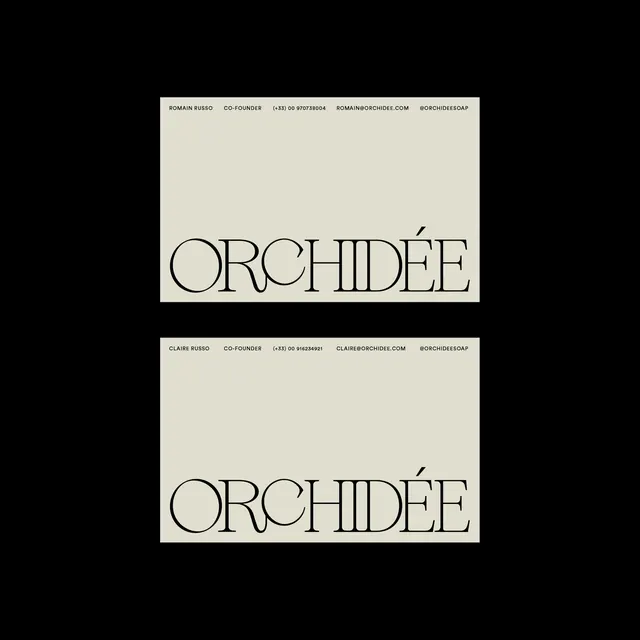
A presentation of a high-contrast serif wordmark featuring two distinct weights and layouts.
Summary
A presentation of a high-contrast serif wordmark featuring two distinct weights and layouts.
Visual description
Two vertical layouts showcasing the word 'ORCHIDÉE' in a sophisticated, high-contrast serif typeface. The top version uses a thinner weight while the bottom version uses a bolder weight, both accompanied by small sans-serif secondary text at the top.
Key takeaway
The design demonstrates how varying stroke weights in a serif typeface can shift the brand's visual weight while maintaining a consistent identity.
Reuse notes
Use as a reference for high-end editorial branding or luxury product packaging.
More like this
Keep what you find
A free account saves references to boards and can send you a weekly email of picks based on what you save.
To see every result, go Pro.