Preview image. Unlock full-res
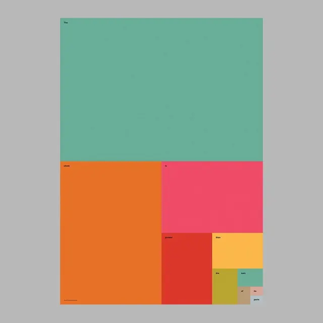
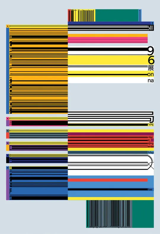
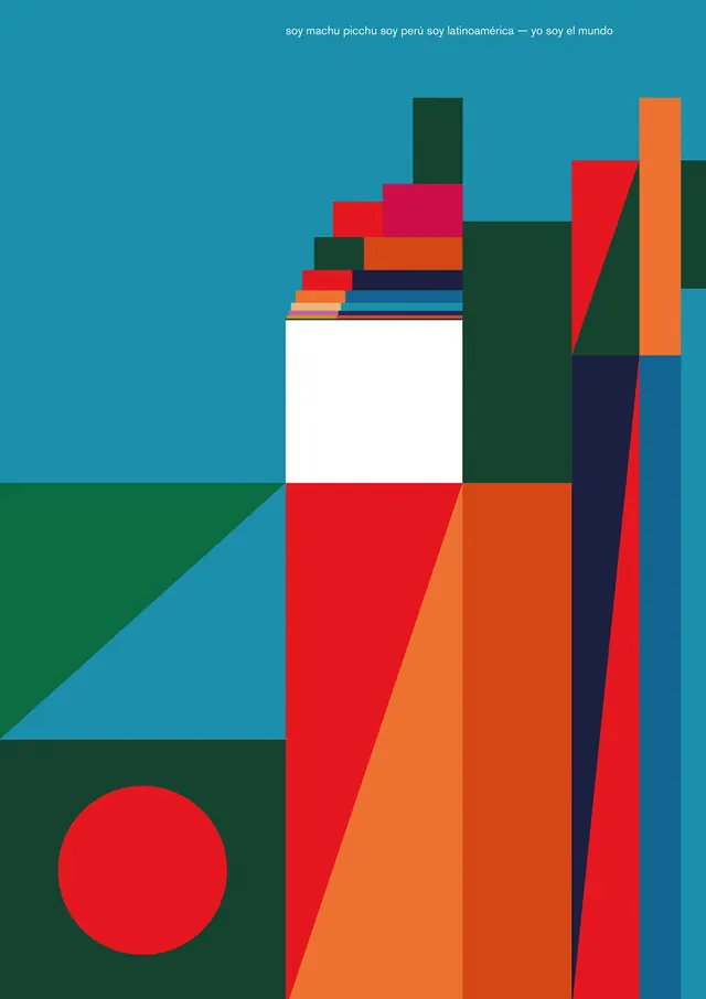
A grid-based layout featuring large, solid blocks of contrasting colors arranged in a modular, asymmetrical fashion.

Summary
A grid-based layout featuring large, solid blocks of contrasting colors arranged in a modular, asymmetrical fashion.
Visual description
The design consists of large rectangular blocks in teal, orange, pink, and red. Small text labels are placed in the corners of several blocks, following a strict grid system.
Key takeaway
The composition demonstrates how bold color blocking and modular grids can create a dynamic visual hierarchy.
Reuse notes
Use this layout as a template for a vibrant brand identity system or a modular editorial spread.
More like this
Keep what you find
A free account saves references to boards and can send you a weekly email of picks based on what you save.
To see every result, go Pro.