Preview image. Unlock full-res
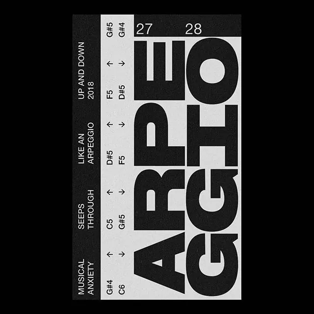
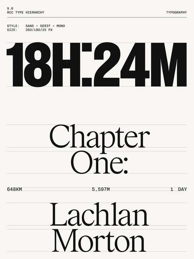
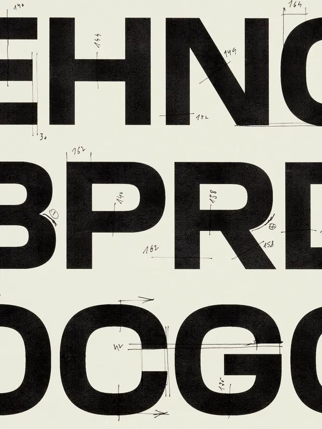
A technical layout showcasing various font weights and sizes of a bold sans-serif typeface, organized in a structured grid with corresponding numerical values.
Summary
A technical layout showcasing various font weights and sizes of a bold sans-serif typeface, organized in a structured grid with corresponding numerical values.
Visual description
A black and white vertical layout featuring large, heavy sans-serif characters 'ARGE' and 'GHO' stacked on the right. The left side contains a structured list of names, dates, and font weight codes (e.g., G4, G5, F5) aligned with arrows.
Key takeaway
Demonstrates a systematic approach to typography where weight and scale are mapped to specific identifiers.
Reuse notes
Use as a reference for establishing a consistent typographic hierarchy and weight system in a brand identity.
More like this

Keep what you find
A free account saves references to boards and can send you a weekly email of picks based on what you save.
To see every result, go Pro.