Preview image. Unlock full-res
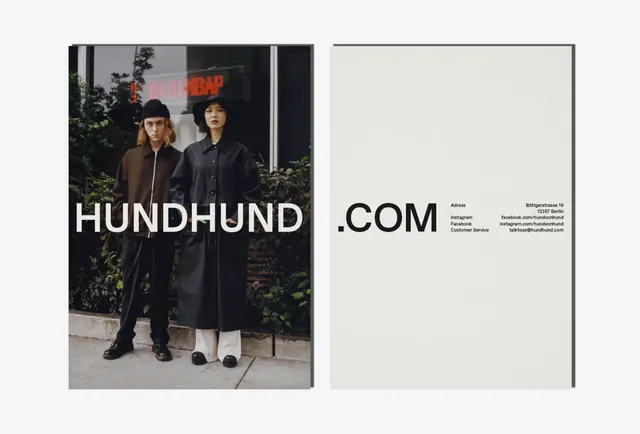
A minimalist brand identity presentation featuring a high-contrast wordmark overlaid on a photograph of two people and a clean layout with secondary typography.
Summary
A minimalist brand identity presentation featuring a high-contrast wordmark overlaid on a photograph of two people and a clean layout with secondary typography.
Visual description
The left side shows a black and white photograph of two people in long coats with a large, bold sans-serif wordmark across the center. The right side features a clean white space with a smaller logo, a dot, and technical-style typography details.
Key takeaway
The design uses extreme scale contrast between oversized primary branding and small, technical secondary information.
Reuse notes
Apply bold, oversized sans-serif typography over high-contrast photography for a premium editorial look.
More like this
Keep what you find
A free account saves references to boards and can send you a weekly email of picks based on what you save.
To see every result, go Pro.