Preview image. Unlock full-res
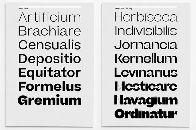
A side-by-side comparison of two vertical lists of Latin words in a bold, serif typeface.
Summary
A side-by-side comparison of two vertical lists of Latin words in a bold, serif typeface.
Visual description
Two white rectangular cards with thin black borders containing vertically stacked Latin words. The text is set in a high-contrast, bold serif font with generous leading.
Key takeaway
The design demonstrates how bold serif typography can create a sophisticated, structured aesthetic through simple vertical alignment.
Reuse notes
Use as a reference for high-end editorial layouts or minimalist branding that prioritizes classical typography.
More like this



Keep what you find
A free account saves references to boards and can send you a weekly email of picks based on what you save.
To see every result, go Pro.