Preview image. Unlock full-res
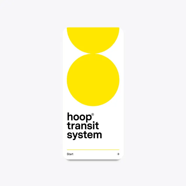
A minimalist visual identity featuring a bold yellow circular graphic and clean sans-serif typography.
Summary
A minimalist visual identity featuring a bold yellow circular graphic and clean sans-serif typography.
Visual description
The design features a large yellow graphic composed of two overlapping circles forming a pill-like shape. Below, the 'hoop transit system' wordmark is set in a bold, black sans-serif font with a thin horizontal line separator.
Key takeaway
The design uses high-contrast colors and geometric simplicity to create a highly legible and recognizable brand mark.
Reuse notes
The circular motif and bold typography can be adapted for signage, wayfinding, and digital interfaces.
More like this

Keep what you find
A free account saves references to boards and can send you a weekly email of picks based on what you save.
To see every result, go Pro.