Preview image. Unlock full-res
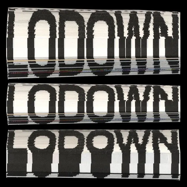
A series of three horizontal wordmark variations featuring heavy distortion and linear interference effects.

Summary
A series of three horizontal wordmark variations featuring heavy distortion and linear interference effects.
Visual description
The word 'DOWN' is repeated three times in a bold, heavy sans-serif font. Each iteration features different horizontal line distortions and 'glitch' effects that slice through the letterforms.
Key takeaway
The design uses extreme typographic distortion to create a sense of movement and digital interference.
Reuse notes
Can be used as a reference for experimental branding, glitch-art aesthetics, or high-impact editorial headers.
More like this
Keep what you find
A free account saves references to boards and can send you a weekly email of picks based on what you save.
To see every result, go Pro.