Preview image. Unlock full-res
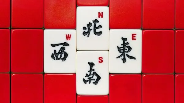
Bold graphic composition of red tiles with white insets displaying Chinese directional characters (north, south, east, west) in a structured compass-like pattern.
Summary
A rigid grid of red tiles with white inset squares forming a cross pattern, each white tile hand-lettered with a black Chinese character representing compass directions (north, south, east, west and center).
Visual description
A regular grid of uniform square tiles fills the frame, predominantly vivid red with deeper burgundy shadow or depth effects between tiles. Five white square tiles form a cardinal cross pattern at the center, each bearing a single black character rendered in thick brush-stroke style calligraphy. The characters represent directional markers: north, south, east, west, and center. The composition uses strict symmetry and geometric precision, with the white and black elements creating stark contrast against the saturated red field. The hand-drawn quality of the calligraphy introduces organic irregularity that plays against the mechanical grid structure, creating visual tension between order and expressiveness.
Key takeaway
The directional system itself works as both functional and aesthetic; the visual hierarchy is established entirely through color blocking and strategic placement rather than size or opacity changes. The juxtaposition of geometric grid with handwritten calligraphy creates visual interest while maintaining readability and structure.
Reuse notes
Ideal for wayfinding systems, gaming interfaces, cultural design projects, or any composition needing compass-like navigation cues. The bold red-and-white palette works for both traditional and contemporary contexts. The modular tile approach scales easily for signage, digital interfaces, or print applications where directional clarity and visual impact are priorities.
More like this



Keep what you find
A free account saves references to boards and can send you a weekly email of picks based on what you save.
To see every result, go Pro.