Preview image. Unlock full-res
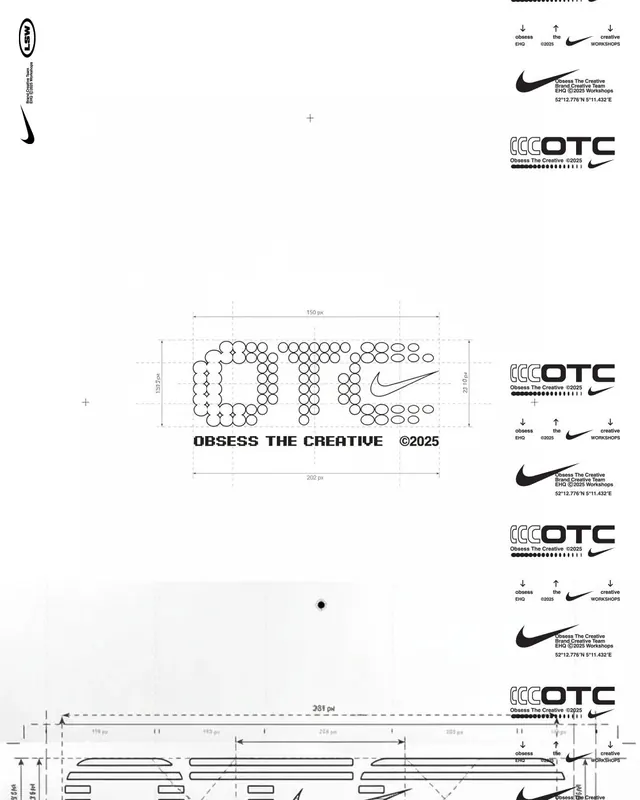
Technical brand specification sheet showing logo placement grids, sizing rules, and application variations for Nike OTC partnership, using dotted construction geometry.
Summary
Technical brand specification sheet showing logo placement grids, sizing rules, and application variations for Nike OTC partnership, using dotted construction geometry.
Visual description
A monochromatic specification sheet dominated by a large central logo composed of small circles forming letterforms ("OTC" with Nike swoosh), with precise construction lines and pixel measurements. Surrounding the central logo are multiple smaller Nike OTC lockup variations showing different clearance rules, orientation guides, and sizing constraints marked with dimensions in pixels (150px, 202px, 281px visible). The left and right margins show the Nike swoosh in various scales. Construction geometry includes dotted grid lines, horizontal/vertical centerlines, and annotation markers. All text is sans-serif in black on white. Minimal color palette with gray guidelines for technical clarity.
Key takeaway
The construction-based approach to logo lockups shows how complex brand systems can be documented with precision. The dotted circle grid method makes the logo's underlying geometry transparent. Multiple weight/scale variations on one sheet reduce ambiguity about when and how to apply each version.
Reuse notes
Essential reference for brand specification design, technical documentation, or logo systems work. The clear measurement notation and multiple application states make it ideal for developer handoff or brand guideline authoring. Use when you need to communicate exact sizing and placement rules without prose.
More like this




Keep what you find
A free account saves references to boards and can send you a weekly email of picks based on what you save.
To see every result, go Pro.