Preview image. Unlock full-res
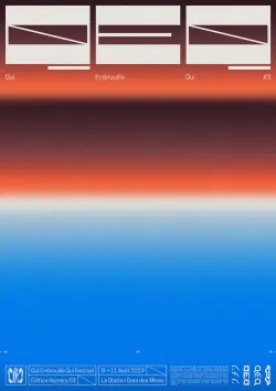
Horizontal layout combining minimal UI wireframes at the top with a full-height gradient spanning burnt orange to sky blue, anchored by type and UI controls at the baseline.
Summary
A minimal interface composition layering simplified UI wireframes above a bold horizontal gradient transitioning from warm terracotta tones through coral to cool sky blue.
Visual description
Three small rectangular frames with horizontal line elements sit anchored at the top, suggesting control panels or preview states. Below sits a dominant full-height gradient field: warm burnt orange at the top blending through peachy coral in the midtones to deep sky blue at the bottom, creating a strong thermal and spatial temperature shift. A thin baseline with small UI labels and controls anchors the composition at the foot, suggesting functional chrome. The overall effect is a vertical thermometer reading from heat to cold.
Key takeaway
The unadorned gradient as a primary compositional element without decoration or texture. The wire frames at the top create functional context without cluttering the gradient. The color temperature shift (warm to cool) reads as both aesthetic and metaphorical.
Reuse notes
Strong for abstract UI concepts, design system documentation, or digital product hero graphics. Works well at large scale where the gradient can breathe. Pairs naturally with sans-serif type for modern SaaS or digital-first brands.
More like this
Keep what you find
A free account saves references to boards and can send you a weekly email of picks based on what you save.
To see every result, go Pro.