Preview image. Unlock full-res
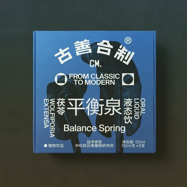
A minimalist beverage box blending traditional Chinese characters with clean English sans-serif and a matte blue background.
Summary
A minimalist product box showing typography as primary design driver, pairing traditional Chinese script with modern sans-serif and blue-on-white contrast.
Visual description
A matte bright blue cardboard box photographed from the front against a dark gray-green background. The front face is nearly entirely white label with a centered, symmetrical composition. Large Chinese characters in white outline dominate the vertical center, flanked by English words in all-caps sans-serif running vertically down the left and right edges ("FROM CLASSIC TO MODERN" prominent across the middle in clean caps). Below the main block sits a smaller row of Chinese script in light blue outline, then "Balance Spring" in sans-serif center-aligned. Lower third contains small product info (weight, manufacturer marks) in reduced sans-serif. No imagery, no illustration, no color blocks, no visual ornamentation beyond the typography itself and a single horizontal blue divider rule above the fine print. The composition is perfectly centered and symmetrical.
Key takeaway
Pure typography as visual identity. No iconography, no color field, just strategic weight and size contrast within a single font family to create hierarchy and visual interest. The use of vertical edge text to frame the center creates a contained, composed feel. Bilingual layout handled by treating each language as its own visual layer rather than mixing weights or colors per language, which would fragment the design.
Reuse notes
Ideal for premium, heritage, or artisanal food and beverage products where linguistic/cultural depth is part of brand story. Works for packaging, book covers, and luxury stationery. The balance of restraint and precision suggests quality without loudness, good for international or multicultural markets. Requires confident, legible typography selection to avoid looking sparse or cheap.
More like this


Keep what you find
A free account saves references to boards and can send you a weekly email of picks based on what you save.
To see every result, go Pro.