Preview image. Unlock full-res
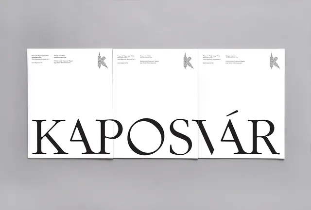
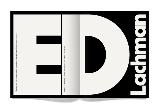
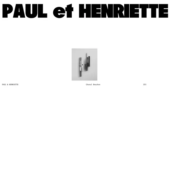
A minimalist typographic layout featuring a large, high-contrast wordmark with smaller secondary text blocks above it.
Summary
A minimalist typographic layout featuring a large, high-contrast wordmark with smaller secondary text blocks above it.
Visual description
The design features the word 'KAPOSVÁR' in a large, high-contrast serif typeface across three panels. Above the main text, smaller blocks of text and small graphic icons are arranged in a structured, grid-like layout.
Key takeaway
The design demonstrates how to balance oversized display typography with dense, smaller information using a clean grid system.
Reuse notes
Use this layout style for high-end editorial headers or minimalist brand identity presentations.
More like this

Keep what you find
A free account saves references to boards and can send you a weekly email of picks based on what you save.
To see every result, go Pro.