Preview image. Unlock full-res
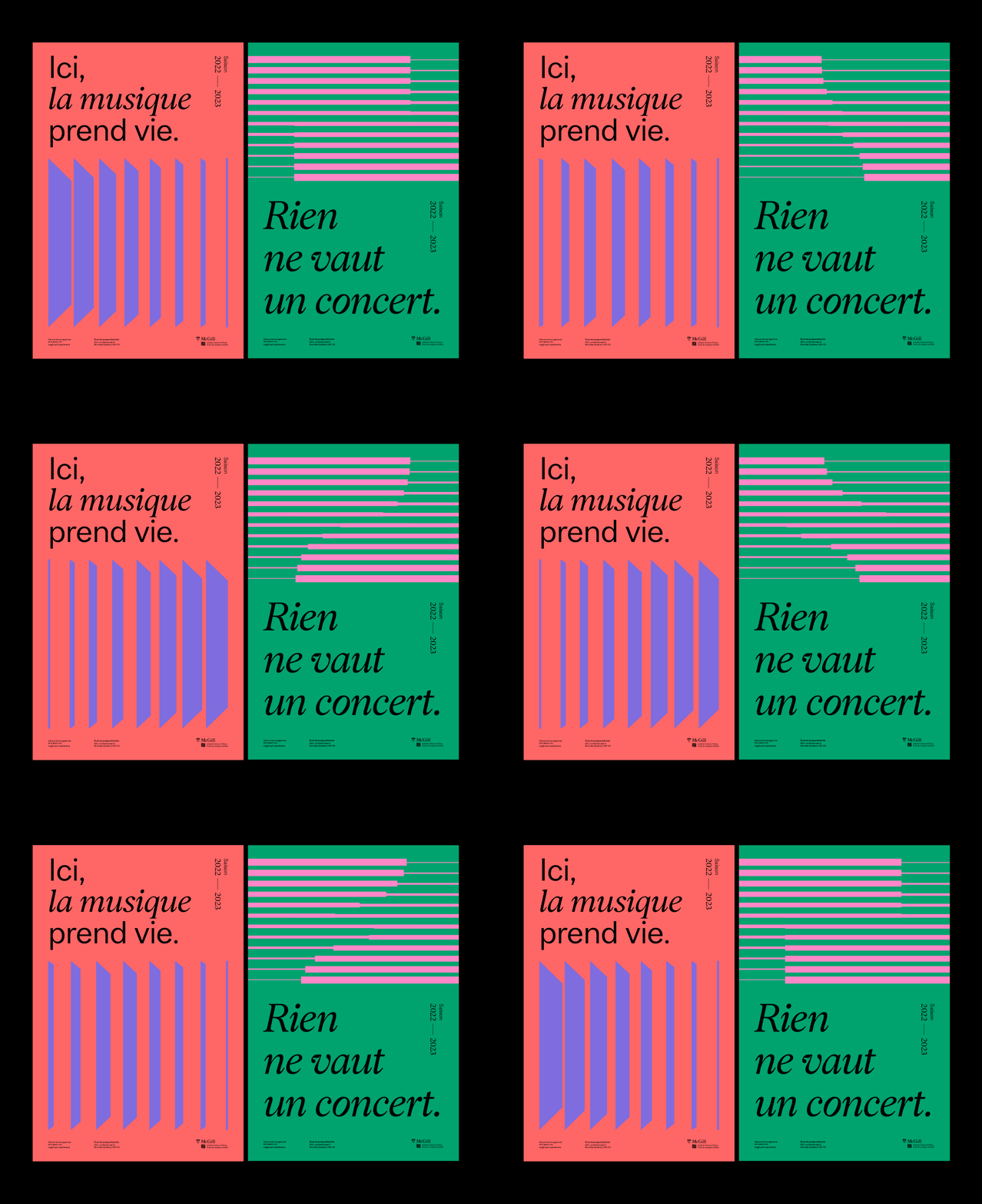
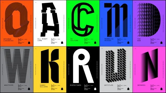
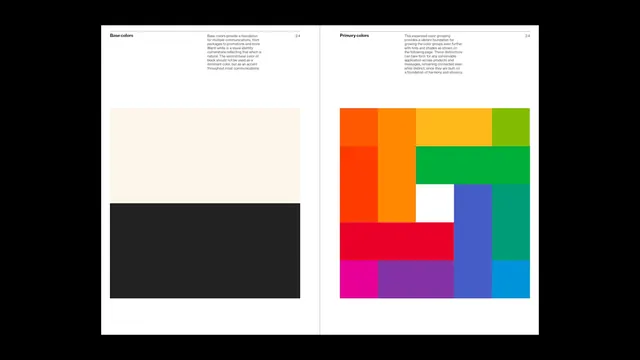
Two-panel poster split coral-and-emerald for a music festival, employing rhythm through bold type on one side and repeated striped geometry on the other.
Summary
A festival poster split into two color fields (salmon and emerald) balancing typographic hierarchy on one side with rhythmic geometric stripes on the other, demonstrating applied Swiss design principles for event promotion.
Visual description
Left panel: coral-salmon background with bold, left-aligned French text ("ici, la musique prend vie") in black sans-serif and italic serif, a column of year markers (2022, 2023) at top right, and below the text, a series of three-dimensional chevron or folded-stripe shapes in purple-blue, creating depth. Right panel: emerald green background with repeated horizontal stripes in alternating hot pink and lime green, offset progressively down the panel; larger italic serif text ("Rien ne vaut un concert") sits centered vertically. Both panels carry small McGill branding and footer text. Black background fills the space between and around.
Key takeaway
The alternation of text-heavy and pattern-heavy halves creates compositional balance without symmetry. The color intensity (coral and green at high saturation) commands attention while the stripe rhythm and chevron relief provide visual interest beyond color alone. The mix of sans-serif and italic serif within a single unified grid demonstrates hierarchy and restraint.
Reuse notes
Effective for music, arts, or cultural events where a single visual can function as a self-contained poster. The two-panel logic works well when you need to split information or mood across a layout without subdividing it further. The stripe pattern scales easily for backgrounds or secondary panels.
More like this

Keep what you find
A free account saves references to boards and can send you a weekly email of picks based on what you save.
To see every result, go Pro.