Preview image. Unlock full-res
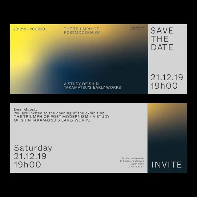
Museum exhibition invite with a bold diagonal gradient from golden-yellow to deep navy-blue, combining typographic hierarchy and color contrast for visual impact.
Summary
A museum exhibition save-the-date combining a bold yellow-to-navy gradient zone with split typographic panels that announce an exhibition opening on December 21, 2019.
Visual description
Two-part composition. The upper section is dominated by a diagonal gradient block, solid bright yellow at the top-left transitioning through olive and teal to deep navy-blue at the bottom-right. Overlaid on this gradient is small, uppercase sans-serif text reading "THE TRIUMPH OF POSTMODERNISM" and "A STUDY OF SHIN TAKAMATSU'S EARLY WORKS" in cream-yellow type. A small institution credit sits top-right in smaller type. The lower section uses a white/off-white background split into two columns: the left contains an invitation message ("Dear Guest, You are invited to the opening of the exhibition...") set in body serif type and a date/time in sans-serif. The right column features a large "INVITE" label in display sans-serif with contact information below. A small gradient accent block (matching the upper palette) appears bottom-right, anchoring the layout.
Key takeaway
The directional color gradient as a compositional element separate from text placement, creating depth without layering. The use of yellow against dark navy as a high-contrast accent. The split-column approach managing different content densities (long invitation copy + short metadata + call-to-action) without looking scattered.
Reuse notes
Ideal for cultural or premium event invitations, exhibition announcements, or launch announcements that need both typographic elegance and immediate visual stopping power. The gradient direction suggests forward motion. Works well in print or digital. The white-background section ensures readability of body copy while the gradient section creates the visual hook.
More like this





Keep what you find
A free account saves references to boards and can send you a weekly email of picks based on what you save.
To see every result, go Pro.