Preview image. Unlock full-res
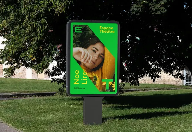
Bold outdoor concert or theatre poster for Space Theatre with bright neon green typography, a portrait cropped and overlaid on color-blocked geometric shapes (forest green, olive, lime), and contrasting serif and sans-serif type on bright green.
Summary
A vibrant outdoor street poster for Space Theatre with bold neon lime typography, a cropped portrait overlaid on forest green and olive color blocks, and high-contrast headline stating "Express Yourself" in large geometric display type on the bright green field.
Visual description
A vertical poster mounted on an outdoor green billboard in a park. The composition uses a split color-block approach: bright neon green on the left occupies roughly one-third of the width and contains large white sans-serif text reading "Express Yourself" (with "Express" in smaller caps). A portrait of a person wearing a warm mustard/tan-colored garment sits off-center, cropped and layered across the color boundary between the neon green section and the darker olive-green and forest-green geometric shapes on the right. The portrait's warmth (skin tone, fabric) contrasts sharply against the cool neon and deep greens. Additional text appears in smaller sans-serif on the green section. No visible shadows or gradients; colors are flat and saturated.
Key takeaway
The neon green pop against deep forest tones is instantly readable from a distance; it demands attention without flashing or animation. Overlapping the portrait across the color boundary creates visual tension and guides the eye. The bright green stripe on one side focuses the typography (the main hook) while the portrait's warmth humanizes the event. Asymmetrical layout sidesteps symmetry fatigue and gives the poster a contemporary, slightly edgy feel.
Reuse notes
Perfect for cultural events, concerts, exhibitions, and theatre that want to signal creativity and cultural credibility. The high saturation works best for outdoor display (legible in daylight, pops at dusk). The neon green can overwhelm indoors or on small screens; test. Works best at vertical or square aspect ratios. If your event is less provocative or more family-friendly, dial back the neon intensity or use a softer accent color instead. Pair with a serif or script typeface below the headline for contrast and sophistication.
More like this
Keep what you find
A free account saves references to boards and can send you a weekly email of picks based on what you save.
To see every result, go Pro.