Preview image. Unlock full-res
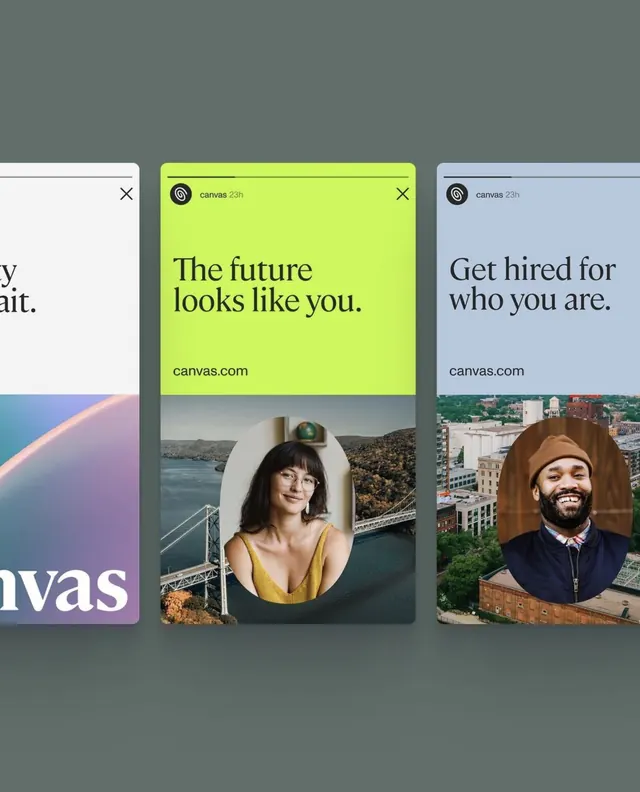
Three stacked UI cards from Canvas showcasing portrait photography, messaging, and brand identity in lime, blue, and white with optimistic typography.
Summary
Three stacked UI cards from Canvas app marketing showcase portrait photography, messaging, and identity, using bright lime green and blue accents on clean white and muted gray backgrounds with confident sans-serif display type.
Visual description
Three overlapping vertical cards are arranged on a muted gray background. The center card features a bright lime-green header with dark type reading "The future looks like you," dark copy below, and "canvas.com" in small text, with a circular cropped portrait of a woman in a yellow dress positioned over an image of a coastal bridge in the lower half. The right card has a light blue-lavender header with the same white logo and "canvas.com" branding, containing text "Get hired for who you are" above a circular portrait of a man in a brown hat against an urban skyline background. A partial left card in white is visible at the edge. The visual language emphasizes user-focused messaging, clean typography, and humanizing product positioning through diverse portraiture.
Key takeaway
The direct juxtaposition of bold color blocks (lime, blue) with warm portrait photography and clear call-to-action copy creates immediate brand differentiation. The circular portrait crop and landscape imagery composite suggests depth and personality while maintaining minimalist card structure. Display-weight sans-serif in the header anchors each message without clutter.
Reuse notes
Strong for SaaS or creative-tool onboarding materials, particularly when emphasizing user empowerment or inclusive community. The card stacking layout works well for carousel or sequential reveal interactions. Pairs well with persona-driven messaging or lifestyle photography in the product or marketing context.
More like this



Keep what you find
A free account saves references to boards and can send you a weekly email of picks based on what you save.
To see every result, go Pro.